BirdieBox
A health-focused platform supporting individuals and families affected by memory loss. The website introduces the product as a "memory companion" — communicating care, trust, and practical support.
Project overview
BirdieBox is a health-focused digital platform designed to support individuals and families affected by memory loss. The website introduces the product as a "memory companion" — clearly communicating care, trust, and practical support while encouraging users to explore and download the app.
Objective
- Communicate empathy and trust for a sensitive health-related product
- Clearly explain how BirdieBox supports memory care
- Encourage app downloads and newsletter sign-ups
- Present the brand as supportive, professional, and human-centred
Calm by design
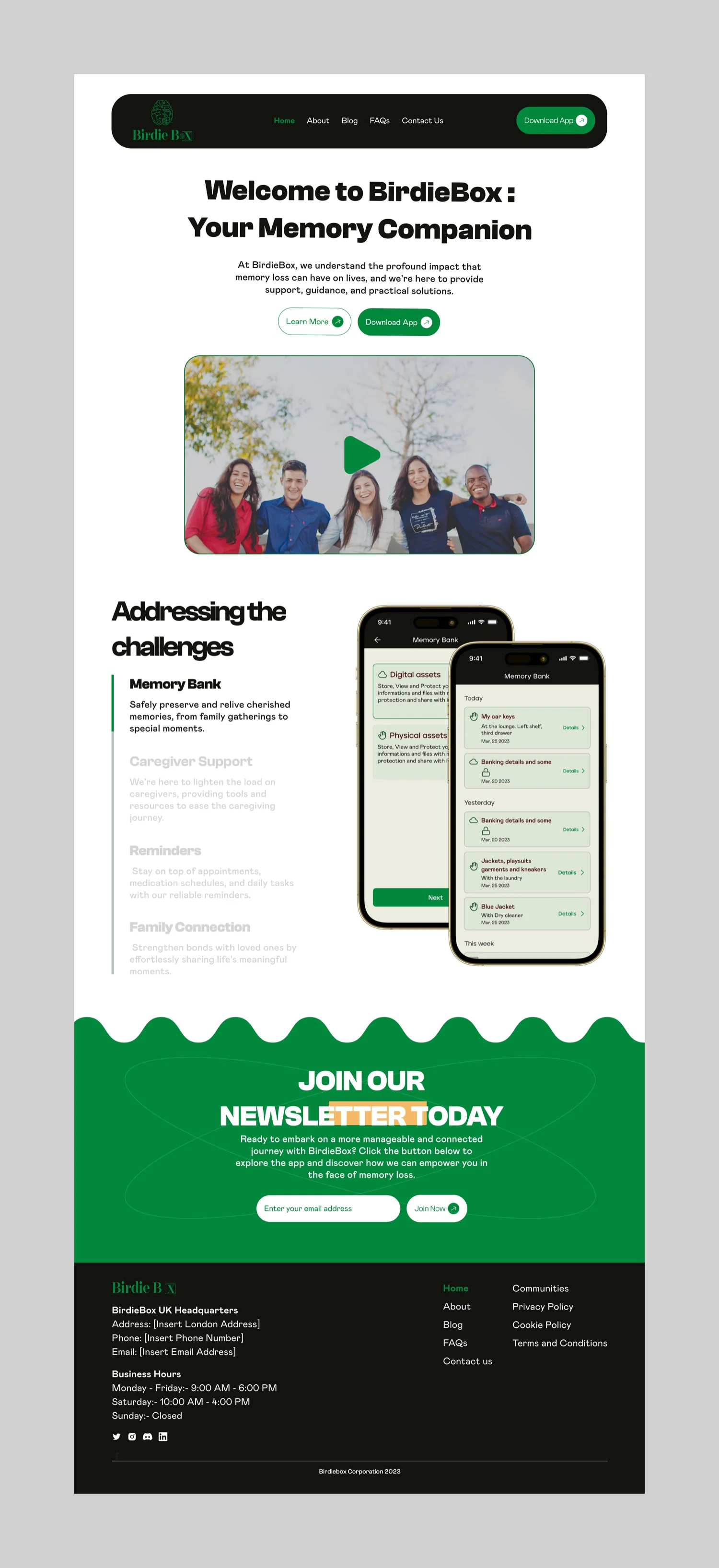
For an audience that may already be under strain, the priority was reducing cognitive load — creating a calm experience that guides users smoothly through the product's benefits.
- A friendly, reassuring hero message to establish emotional connection
- Simple navigation and clear calls-to-action
- Real product screens to explain features visually
- Structured sections that guide users step by step
Key features highlighted
- Memory Bank — storing and revisiting important information
- Caregiver support — tools and reminders
- Family connection features
- Newsletter onboarding for ongoing engagement
Visual & UX decisions
Every choice was weighed against a single question: will this feel reassuring to someone navigating memory loss, or to the family member helping them?
Visual language
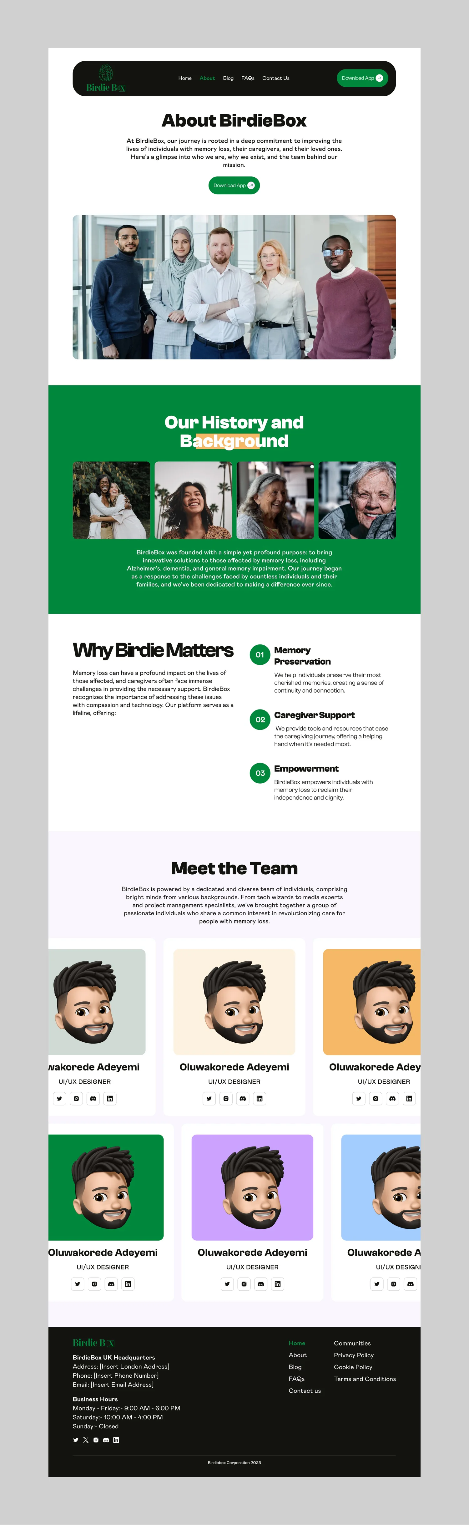
- Soft green palette to communicate care, calm, and health
- Clean typography for readability across age groups
- Clear spacing and layout to avoid overwhelming users
Accessibility
- Accessibility-focused design choices for ease of use
- Type sized for older readers, not just the design grid
- Generous spacing so no section demands close reading
Outcome
The final design positions BirdieBox as a compassionate and reliable memory support platform — balancing emotional sensitivity with functional clarity to build user confidence and trust.