Diaspora Health Cover
Elevating trust and clarity in a live health coverage platform. The product already worked — what it lacked was visual authority, narrative flow, and the trust signals a health and finance domain demands.

Overview
Diaspora Health Cover is a health coverage platform designed to help diaspora users secure reliable healthcare solutions for themselves or their families.
The product was already live when the founder reached out. While functional, the existing website lacked visual authority, structured narrative flow, and the trust-building signals necessary for a health and finance domain.
My goal was not just to "improve visuals" — it was to elevate clarity, credibility, and conversion readiness.
The core challenge
The problem wasn't functionality — it was perception and clarity. Key gaps identified:
- Fragmented content flow with no strategic narrative
- Weak visual hierarchy reducing scannability
- Limited trust signals in a high-stakes domain
- Static, template-like interaction model
- Overly dense messaging increasing cognitive load
In a trust-sensitive product, perceived credibility directly impacts user confidence and decision-making.
The site I inherited
A full capture of the live site as it stood before the redesign. The problems weren't hypothetical — they were visible on the page, and three of them were doing real damage.
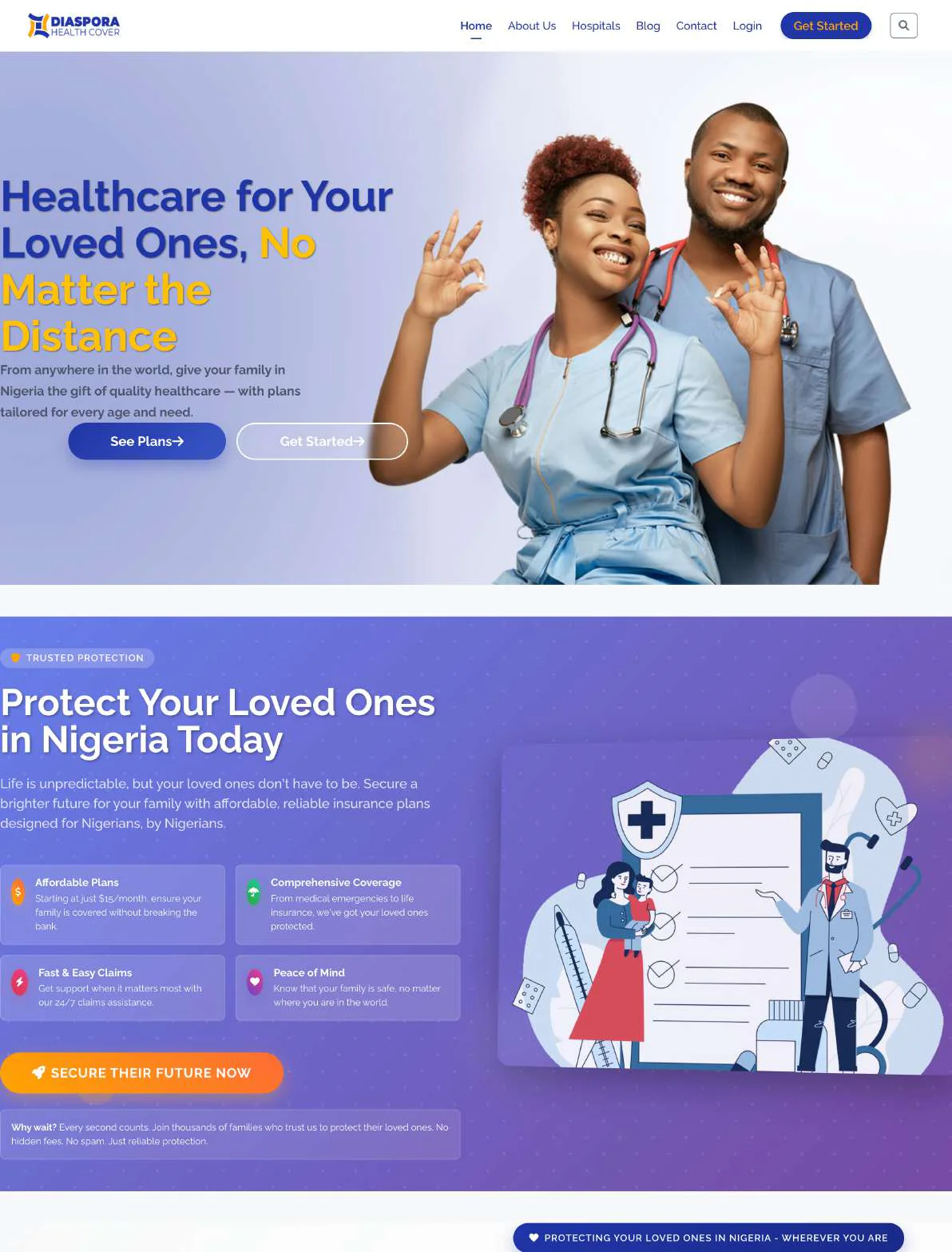
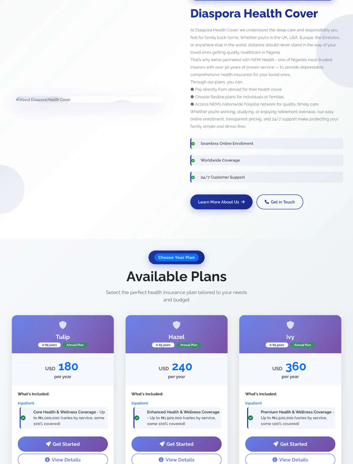
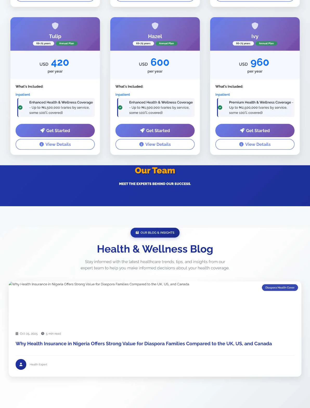
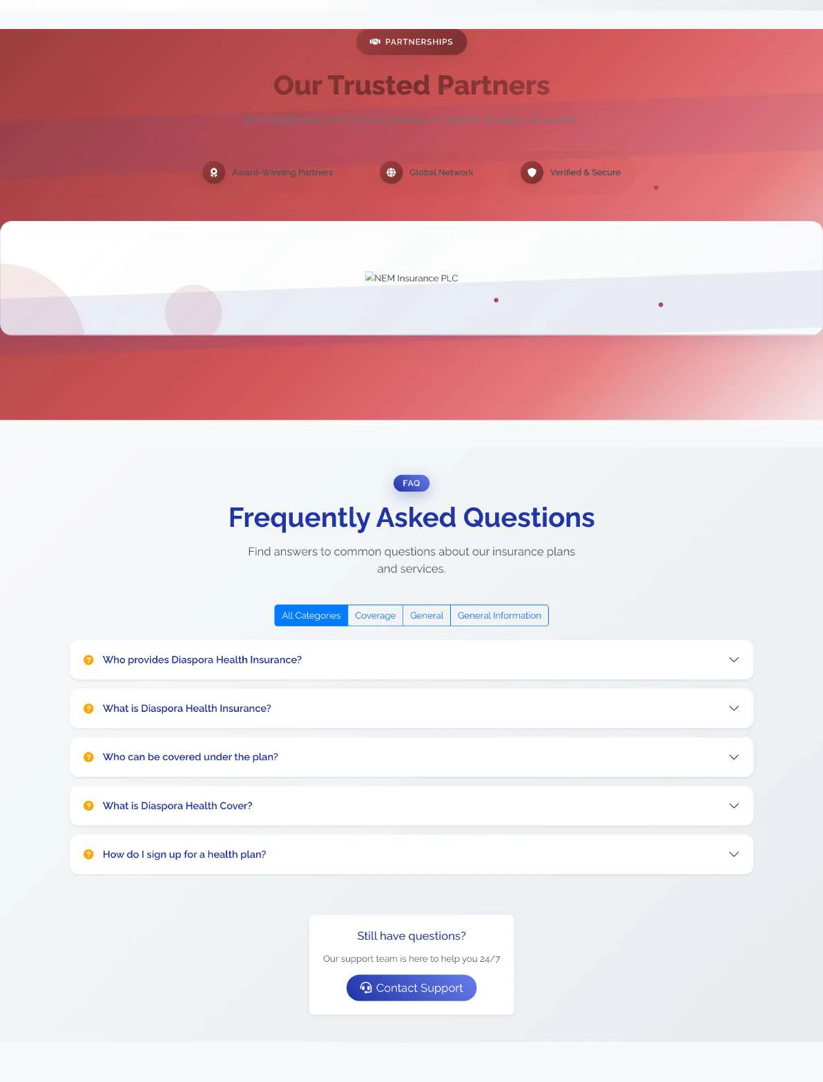
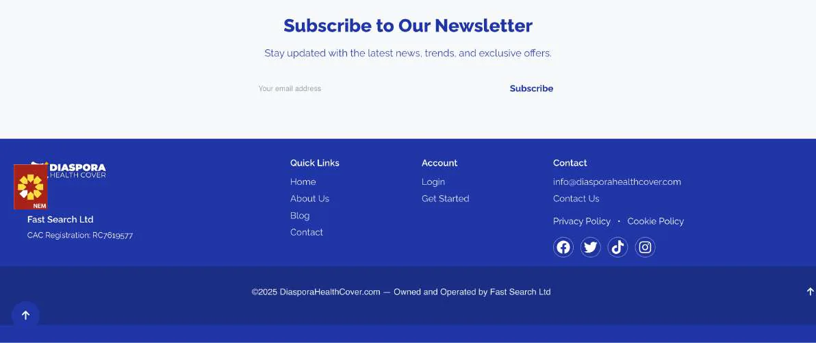
The original site, captured in full. Functional, and visibly a template. Everything below is read from these screens.
Plan names that carried no information
- The three tiers were called Tulip, Hazel, and Ivy — flower names with no relationship to what they cover or who they suit
- A buyer had to read all three cards in full to work out that they ascend in value
- The cost — the naming did none of the work of the decision, so the comparison table had to do all of it
Two currencies in one decision
- Prices were quoted in USD — 420, 600, 960 per year — while the coverage those prices buy was quoted in naira: ₦1,500,000, ₦2,500,000
- The user is a diaspora buyer paying in one currency for care delivered in another, so both numbers matter — but nothing on the page reconciled them
- The cost — the single most important judgement, "is this worth it?", required mental arithmetic at an unknown exchange rate
An empty trust signal
- A full-width band read "Our Team — meet the experts behind our success" and then showed no team at all
- Every plan card carried two competing actions — Get Started and View Details — so no card had a primary next step
- The cost — in a category where people are deciding whether to trust strangers with their family's healthcare, an empty credibility section is worse than no section. It advertises the absence
What changed, against what was there
Each of the three problems above got a different kind of answer. Two of them were solved by removing something rather than adding to it.
- Headline: "Healthcare for Your Loved Ones, No Matter the Distance" — warm, but it never says what the product is
- Nothing above the fold identified the buyer or the mechanism
- Competing actions in the hero: See Plans and Get Started, plus a third Get Started in the nav
- Headline: "Health Insurance for Nigerians in the Diaspora" — plain, literal, and it names the buyer in the first six words
- The subhead states the whole mechanism: pay from the UK, US, Canada or anywhere abroad, family receives care through accredited hospitals across Nigeria
- One hero action — View Health Plans
Why literal beat evocative. "No matter the distance" is a feeling. "Health insurance for Nigerians in the diaspora" is a match test — a visitor knows within one line whether this is for them, which is the only job the top of the page has.
- Tiers named Tulip, Hazel, Ivy with nothing explaining what they meant
- Prices in USD against coverage in naira on the same card
- Two competing buttons per card — Get Started and View Details
- The browse step and the buy step were collapsed into one
- The names were kept — they carry brand equity — but each now sits above a plain sentence saying who it suits: "Tulip is designed for individuals or families who need basic, reliable coverage focused on essential medical services."
- Price removed from the browse step entirely. No currency appears on the homepage at all
- One action per card — View Plan Details — plus a single Compare Health Plans for people who want the numbers side by side
- Choosing a plan and pricing a plan are now two separate decisions
The decision I'd defend hardest. Removing prices from the cards looks like hiding information. It isn't — it separates two questions that were fighting each other. "Which plan fits my family?" is answered by coverage; "can I afford it?" is answered by numbers. Forcing both at once, in two currencies, is what made the original cards unreadable. The naming problem was solved the same way: not by renaming, but by describing.
- An "Our Team" band with the subtitle "meet the experts behind our success" — and no team beneath it
- No named underwriter. Nothing said who actually carries the risk or delivers the care
- No company ownership disclosed
- The empty band is gone. In its place, a named, licensed third party: plans are administered by NEM Health, described on the page as a licensed Nigerian health insurance provider
- The overview states the goal outright — no confusion about "who provides care, who underwrites the policy, or how benefits are accessed"
- The FAQ answers the trust questions directly: "Who provides the health insurance coverage?" and "What role does Diaspora Health Cover play?"
- Corporate ownership disclosed in the footer
Borrowed credibility beats asserted credibility. A new platform cannot manufacture trust by claiming expertise. It can borrow it by naming a licensed partner and being explicit about the division of labour — which is exactly what the empty team section was failing to do.
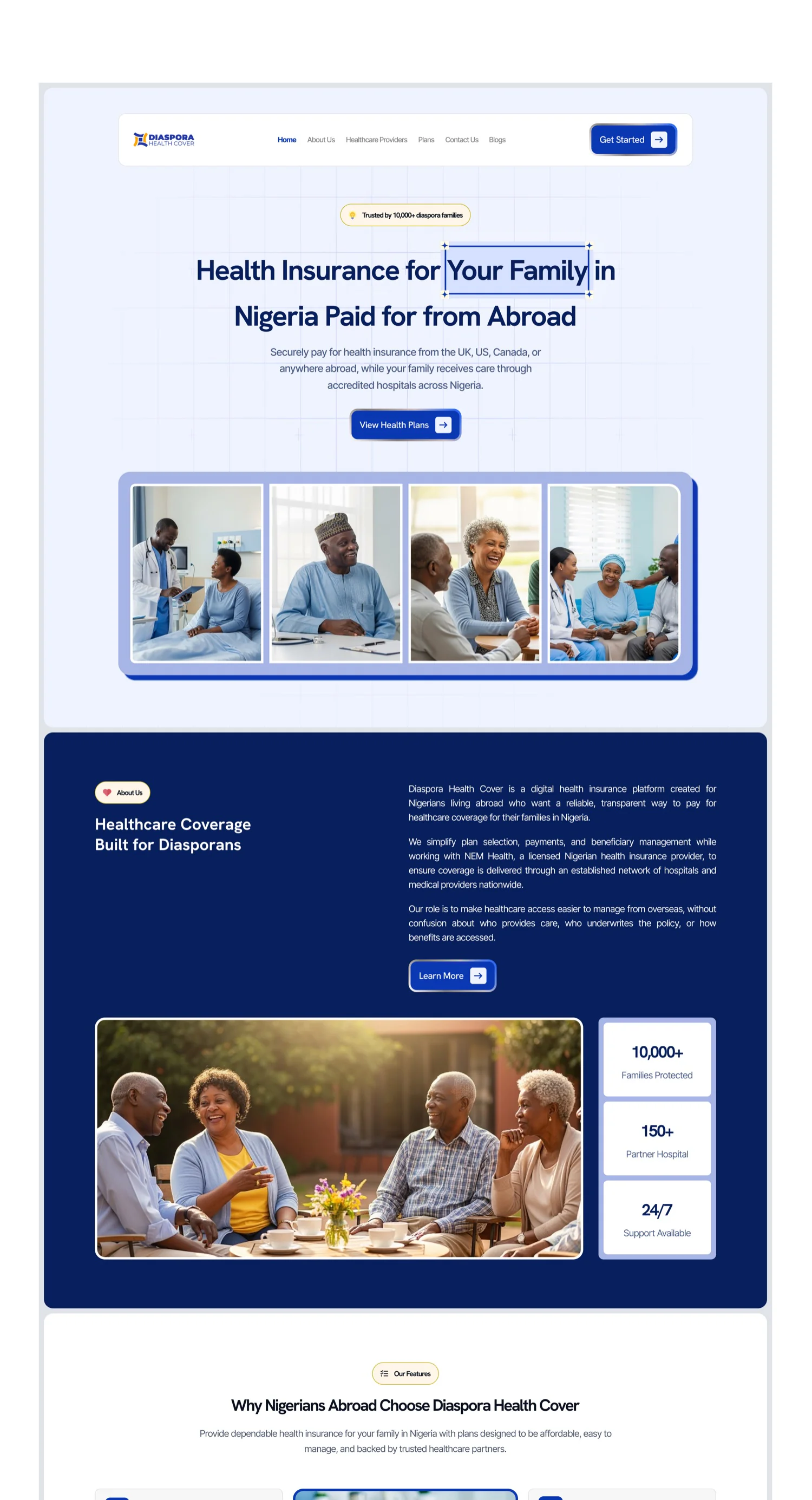
The redesigned landing. One headline that names the buyer, a single View Health Plans action, and the trust band now filled with real numbers — 10,000+ families protected, 150+ partner hospitals, 24/7 support.
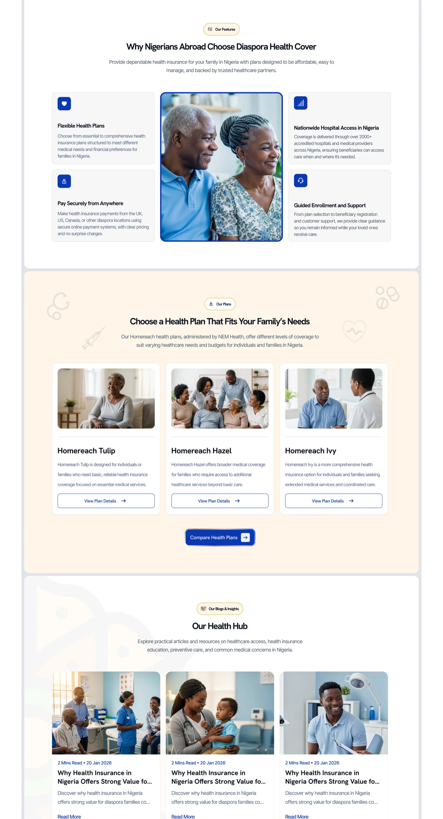
Plans, made comparable. The Tulip / Hazel / Ivy names are kept but each now sits above a plain sentence saying who it suits, with one View Plan Details action and a single Compare Health Plans for people who want the numbers side by side. No currency appears at the browse step.
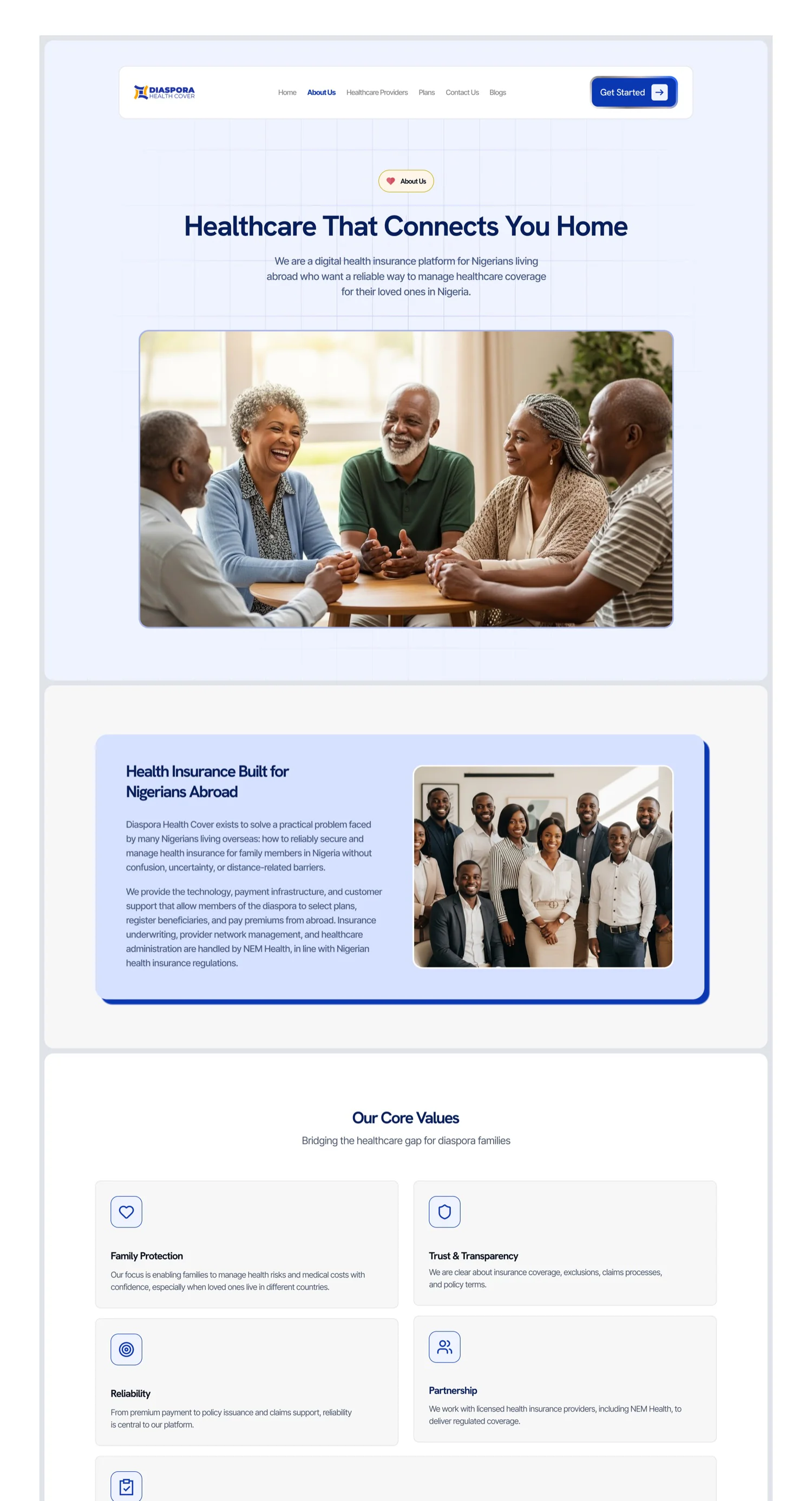
The trust layer the empty band was missing. A named, licensed underwriter (NEM Health), an explicit division of labour, a real team, and stated core values — in place of a heading that promised experts and showed none. Live at diasporahealthcover.com.
Constraints
This was not a greenfield project:
- The platform was already live
- Development environment limitations
- No full technical rebuild
- Time-sensitive delivery
- Limited existing analytics data
- Founder-led decision structure
The redesign had to be impactful without disrupting production.
A product restructuring, not a visual refresh
Treating this as a reskin would have left the underlying clarity problems untouched. Five workstreams carried the redesign.
Narrative Architecture
- Clear positioning at the top
- Reinforced credibility before deep details
- Structured benefits before plan specifics
- Strategic CTA placement aligned with user decision points
Messaging Simplification
- Simplified technical terminology
- Clarified audience targeting
- Converted feature-heavy language into benefit-driven messaging
- Reduced redundancy — the focus shifted from explanation to clarity
Visual Authority System
- Stronger typographic hierarchy
- Improved spacing rhythm
- Clear component consistency
- Refined colour balance
- Structured grid alignment
Motion & Interaction System
- Reinforce section hierarchy
- Improve perceived responsiveness
- Signal technical maturity
- Guide attention through transitions
- Motion was used strategically — not decoratively
Developer Collaboration
- Delivered structured design documentation
- Clarified responsive behaviours
- Reviewed implementation for visual fidelity
- Adjusted components based on technical feasibility
Because the product was already live, this ensured production alignment rather than static mockups.
Fully approved and implemented
The redesign shipped across the live platform, transforming it from a static informational website into a more credible, structured health coverage product.
Observable outcomes
- 100% adoption of the redesigned experience
- Elevated brand authority and visual consistency
- Structured narrative flow guiding users toward plan exploration
- Reduced content density and improved scannability
- Stronger alignment between messaging and user intent
- Scalable design foundation for future iterations
What I learned
- In trust-sensitive domains, clarity is conversion
- Motion should reinforce hierarchy, not distract
- Messaging refinement is as important as visual polish
- Production constraints require pragmatic design decisions
- Small-team environments demand product ownership, not just UI delivery
Formal analytics tracking was limited, so the outcomes above are observational rather than measured — a constraint worth naming honestly in a project of this shape.