PAGPay
A modern, mobile-first fintech app that unifies multi-currency wallets, payments, balance-insights analytics, investments, and a peer-to-peer loan marketplace — designed to solve the fragmented money experience millions of Africans face.
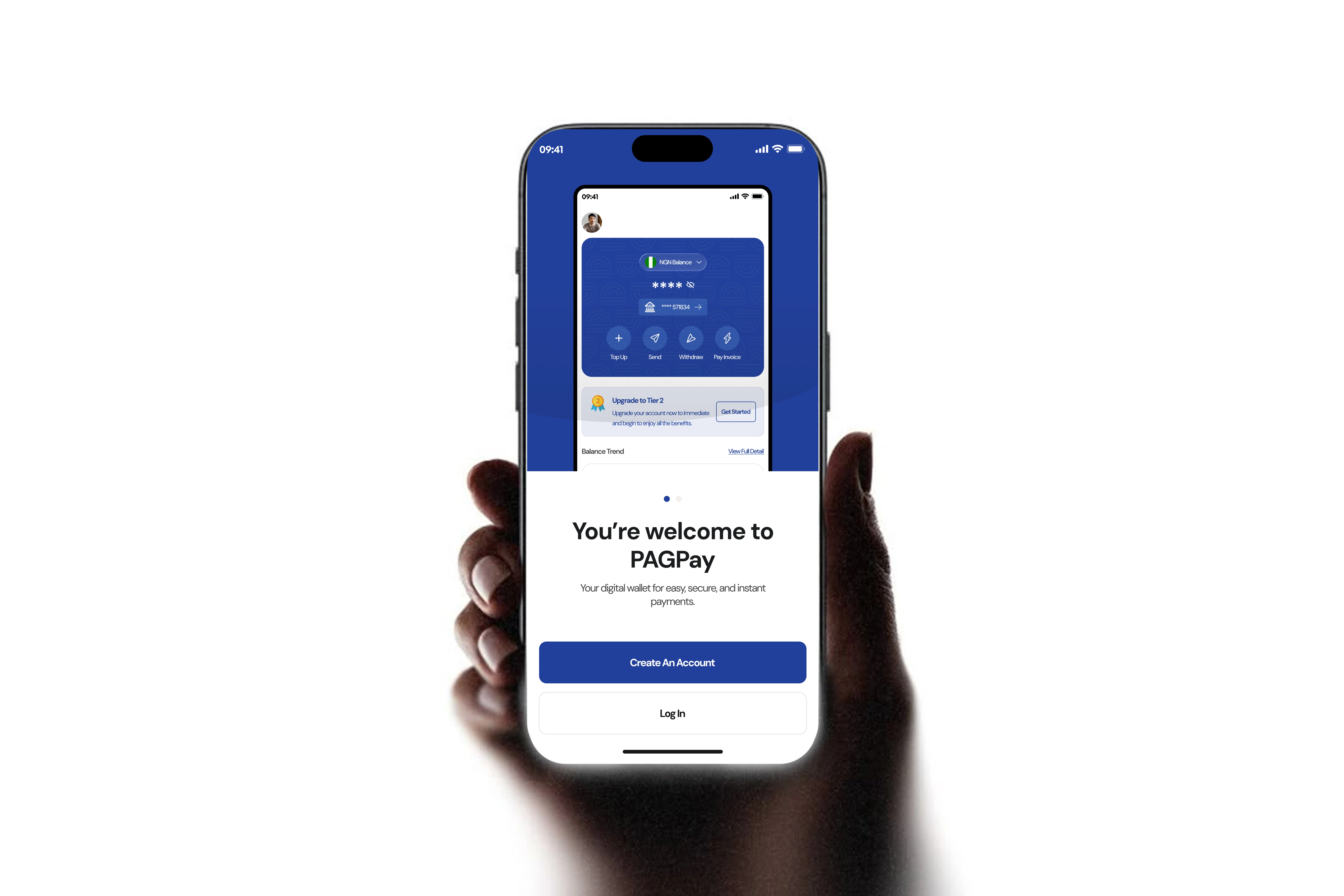
Project overview
PAGPay is a modern, mobile-first fintech application designed to solve the multi-currency problem that millions of Africans face when sending, receiving, and managing money across currencies. Inspired by products like Grey, PAGPay goes further — combining seamless multi-currency wallets with balance-insights analytics, investment products, and a peer-to-peer loan marketplace under one roof.
As the lead designer on this project at Parousia West Africa, I owned the full design lifecycle — from problem definition and user-research insights to wireframing, visual design, prototyping, and the complete high-fidelity screen design across every user journey in the app.
The challenge
Africans — especially those in the DR Congo, Nigeria, Kenya, and other markets — regularly face a painful trifecta when managing money internationally:
- High conversion fees and poor exchange rates when moving money between currencies
- Fragmented tools: one app for transfers, another for investments, another for bills — no unified experience
- Opaque transaction histories with no meaningful financial analytics
- Limited access to formal savings and investment products
- Difficulty sending and receiving money via multiple channels (bank, mobile money, agent networks)
The opportunity
The African fintech space is growing rapidly, and users are increasingly mobile-first and tech-savvy. There was a clear opportunity to design a single, beautifully unified financial platform that handles all of these pain points at once — one that feels premium, culturally relevant, and genuinely useful.
Primary design goals
- Simplify multi-currency management with an intuitive currency-switching UI
- Create a balance-insights feature that actually helps users understand their spending
- Design a complete, end-to-end financial ecosystem: payments, top-ups, investments, loans, and bills
- Establish a strong, trustworthy brand identity through consistent visual design
- Build for scale — tiered KYC levels that unlock features progressively
Design principles
- Clarity first — every screen communicates one primary action
- Trust through transparency — confirmation screens, transaction details, and copy icons reinforce reliability
- Progressive disclosure — advanced features appear only when the user is ready (KYC tiers)
- Consistency — a unified system across 100+ screens reduces cognitive load
One app, eleven connected surfaces
PAGPay covers an unusually large and complete feature set for a fintech app. Here is every section designed, end to end.
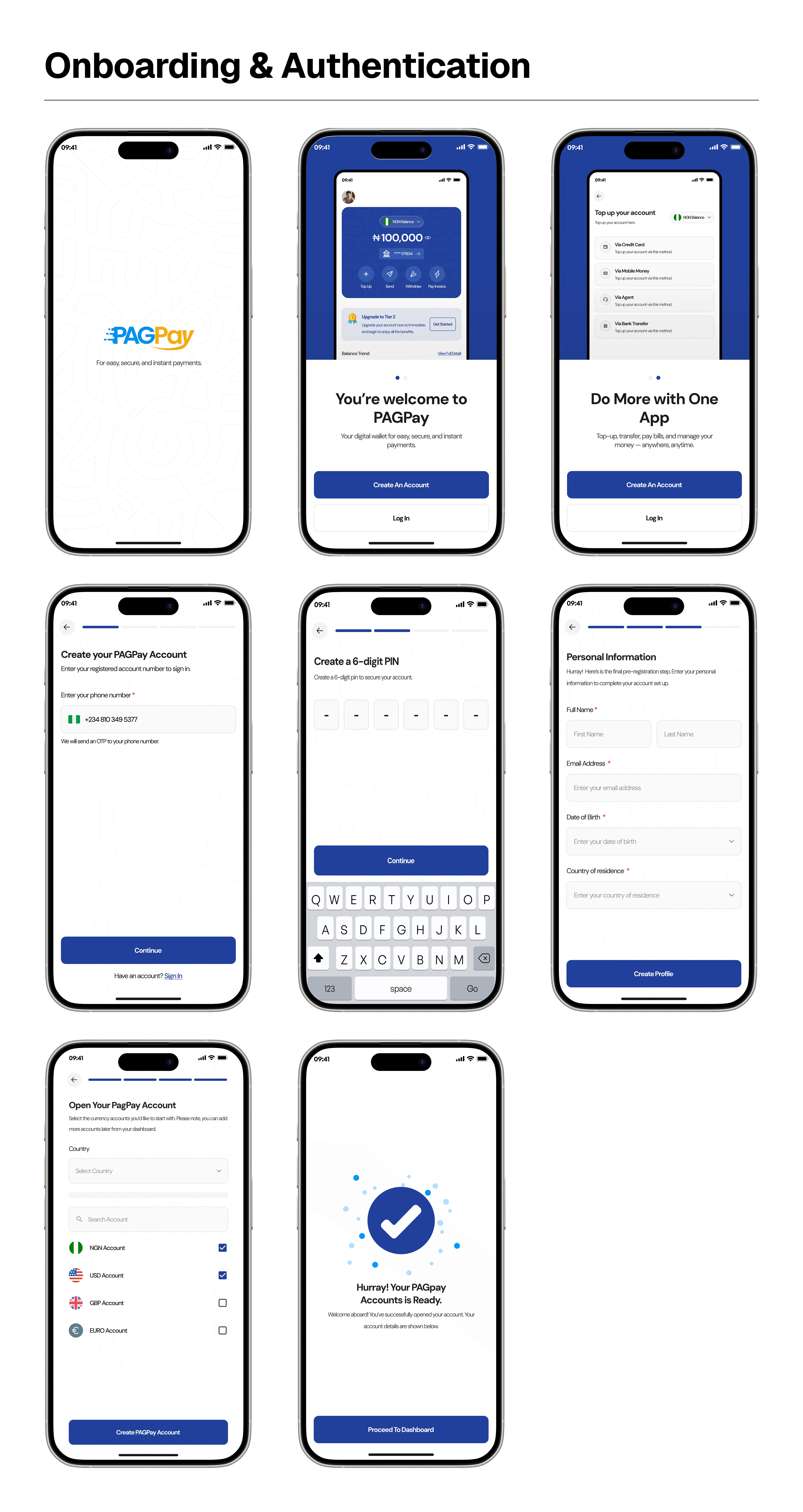
Onboarding & Authentication
- Splash screen — branded entry point with logo and tagline
- Sign up — email, password with visibility toggle, biometric setup, terms acceptance
- Phone number — country flag + number input, Nigerian flag default
- OTP verification — code input with resend option
- 6-digit PIN — secure create-then-confirm flow
- Currency selection — NGN, USD, GBP, EUR with flags and radios
- Profile setup — multi-step completion (name, photo, identity)
- Biometrics — Face ID and fingerprint authentication
- KYC documents — front/back upload with progress states
- Login / Forgot & Reset PIN — full recovery flows
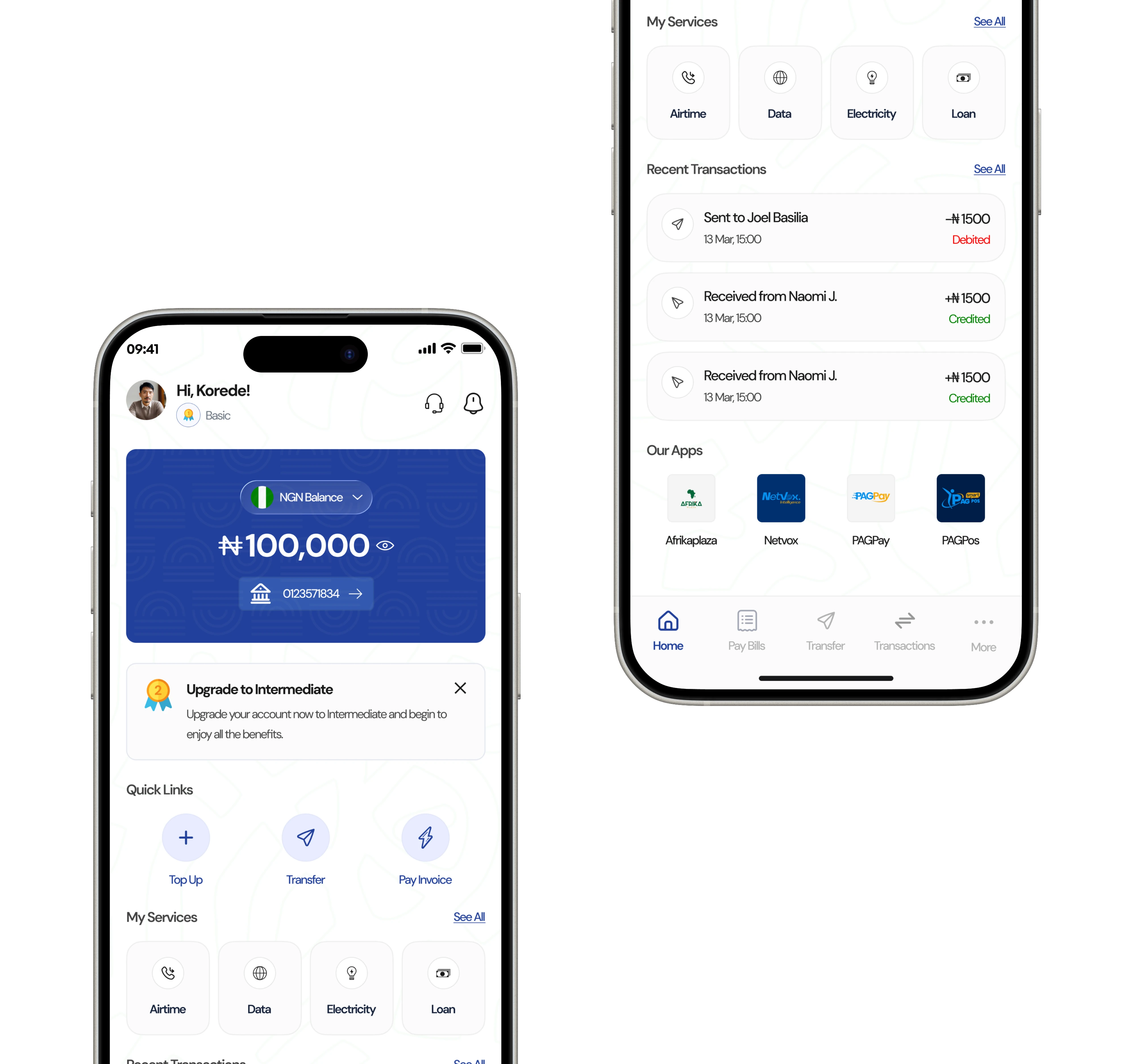
Home Dashboard
- Top navigation with avatar, tier badge, support, and notifications
- Balance card — active currency, balance, account-number chip, hide/show eye
- Dismissible KYC upgrade nudge banner
- Quick Links: Top Up, Transfer, Pay Invoice
- My Services grid: Airtime, Data, Electricity, Loan
- Recent transactions (last 3, with See All)
- Our Apps ecosystem: Afrikaplaza, Netvox, PAGPay, PAGExpress, PAGPos
- Bottom nav: Home, Pay Bills, Transfer, Transactions, More
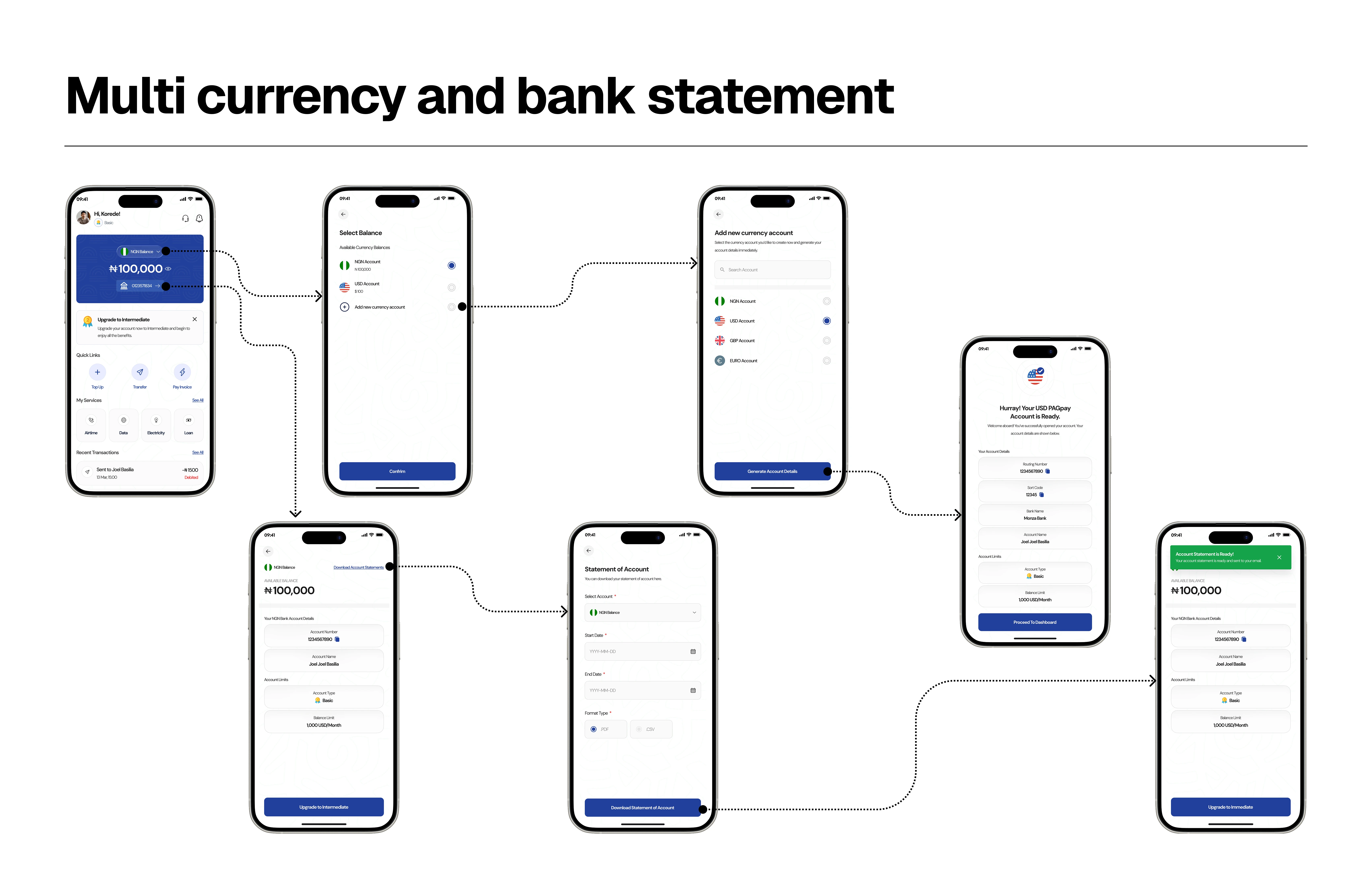
Multi-Currency & Bank Statement
- Multi-currency wallet — hold NGN, USD, GBP, EUR in one account
- Balance switching by tapping the balance card
- Add a new foreign-currency account on demand
- Instant virtual-account generation (number, bank, holder)
- Account details view with balance, info, and tier limits
- Currency-aware actions across transfers, top-ups, payments
- Statements — generate by account, date range, and format (PDF/CSV)
- Download, share, and keep records; clear confirmation states
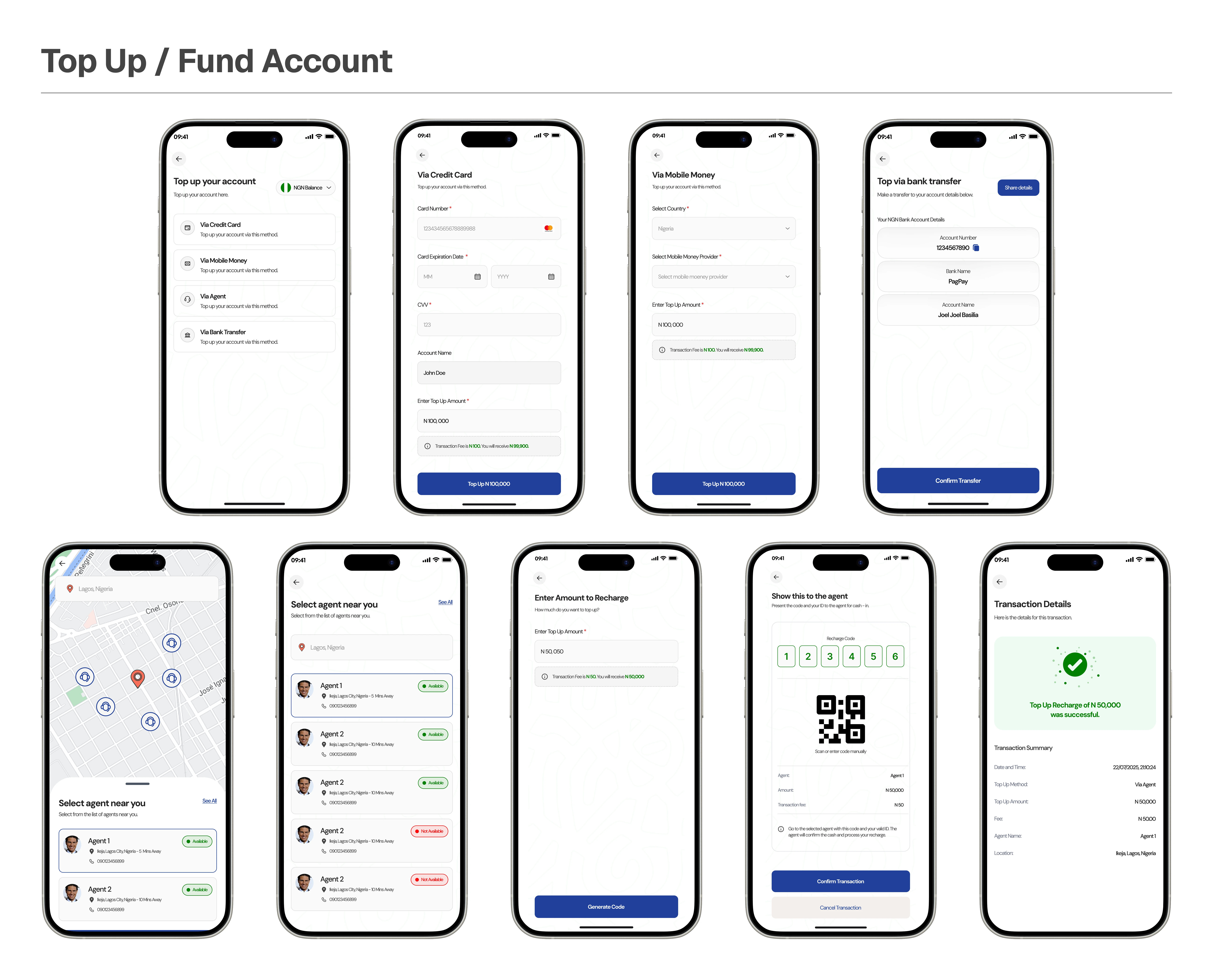
Top Up / Fund Account
- Method selection: card, mobile money, bank transfer, or agent (cash)
- Credit card — number, CVV, expiry with Mastercard branding
- Mobile money — provider, phone number, amount
- Bank transfer — auto-generated virtual account with copy
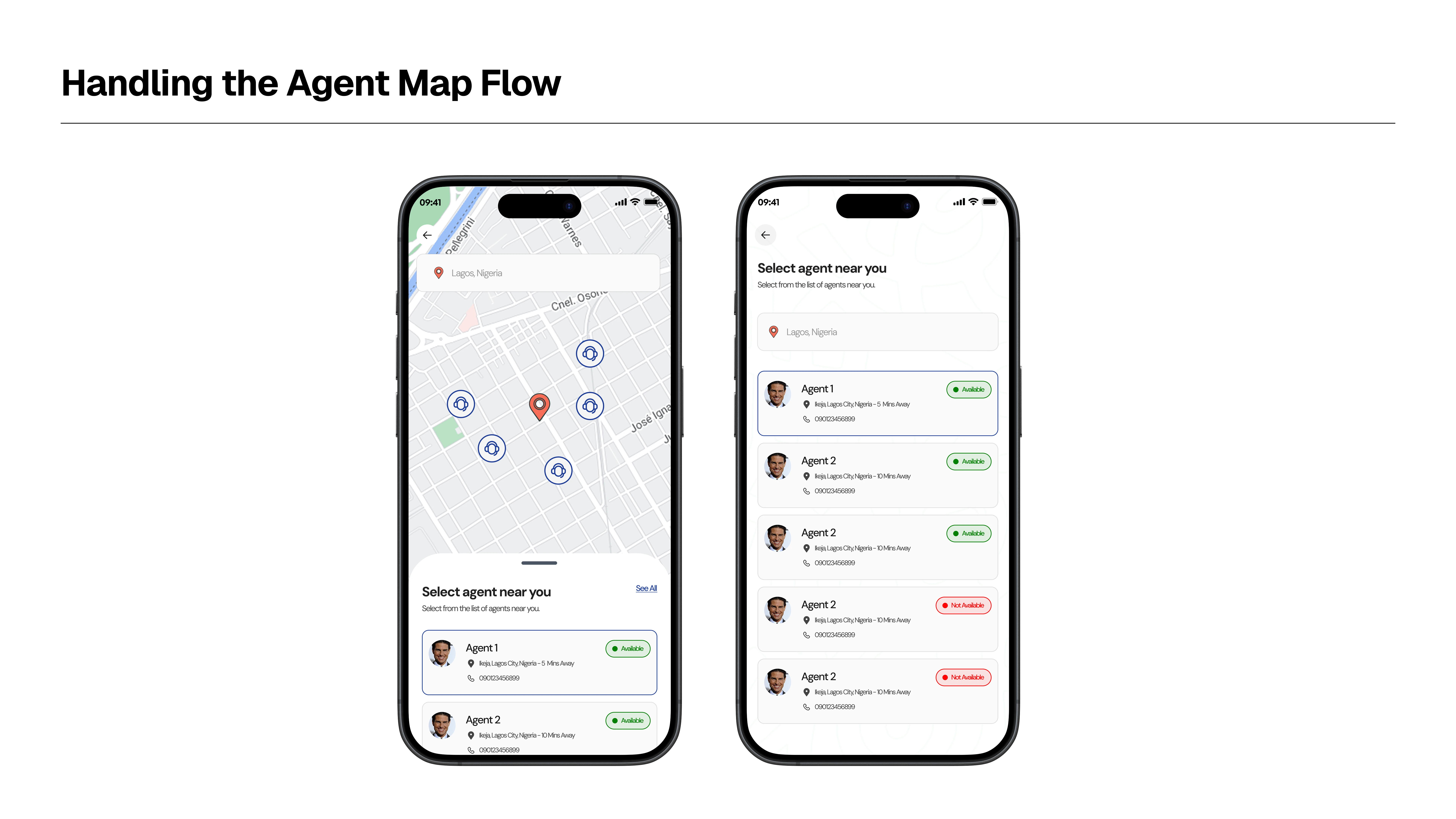
- Agent — map-based finder, agent cards with pin + call, See All list
Send Money / Transfers
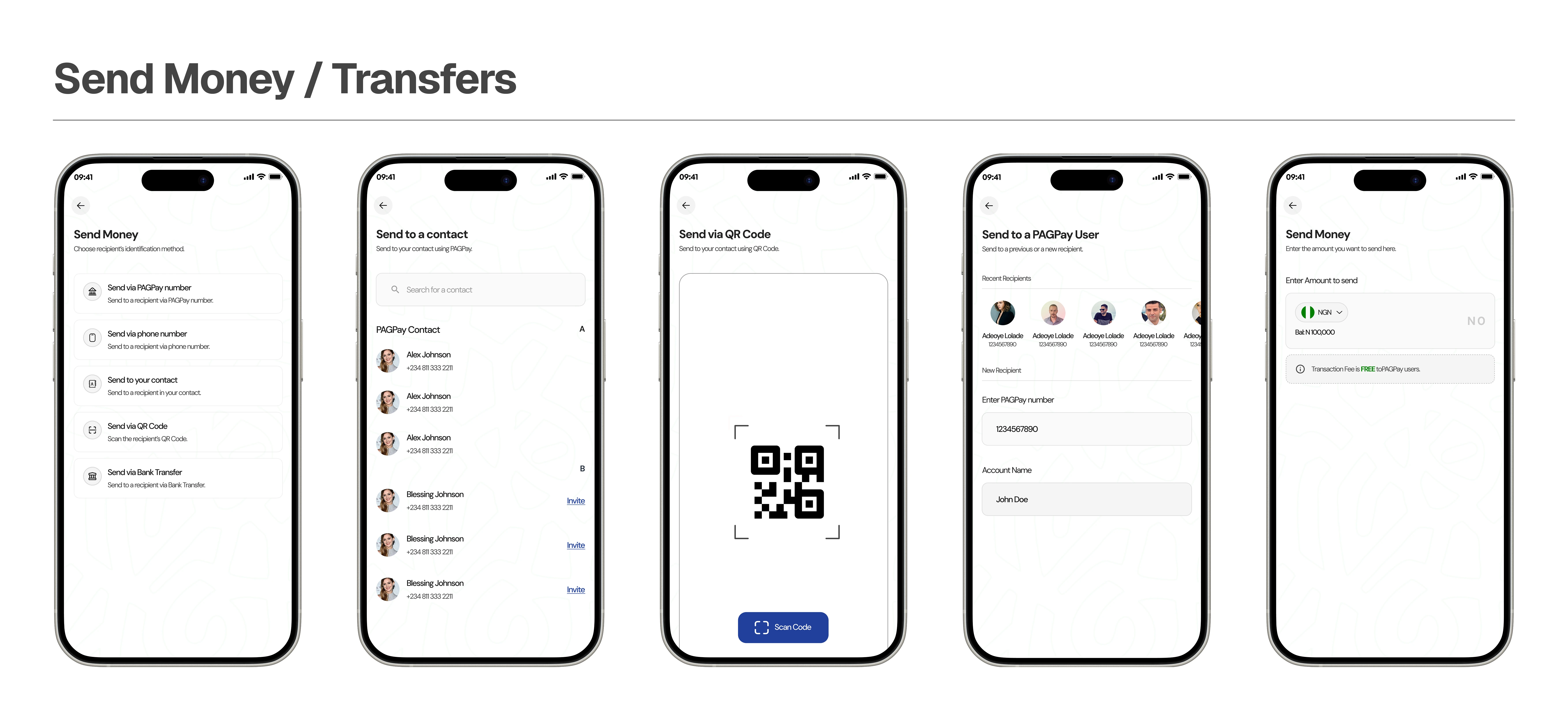
- Methods: PAGPay number, phone, contact, QR code, bank transfer
- Currency selector on every transfer screen
- PAGPay-to-PAGPay — lookup with recipient verification
- Phone-number transfer with country code
- Searchable contact picker with avatars
- QR code scanner and your own shareable QR
- Bank search list with radio selection
- Amount entry with PIN confirmation
- Review, confirmation, and receipt with copy icons
Transactions
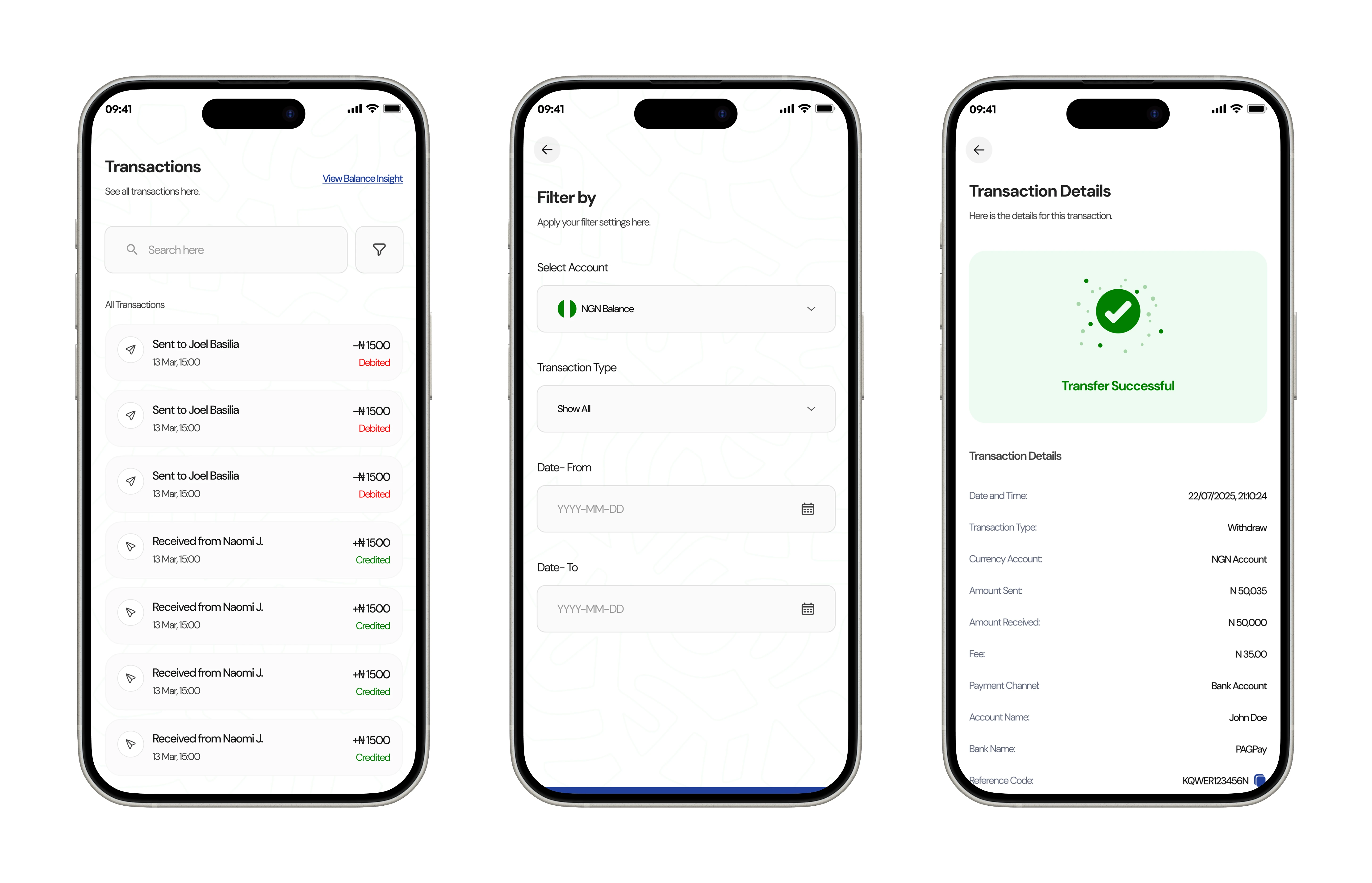
- Full history with search and filter
- Filters: date range, currency, transaction type
- Each row: icon, name, date, amount (debit red, credit green)
- Detail screen: full breakdown, status, reference, category
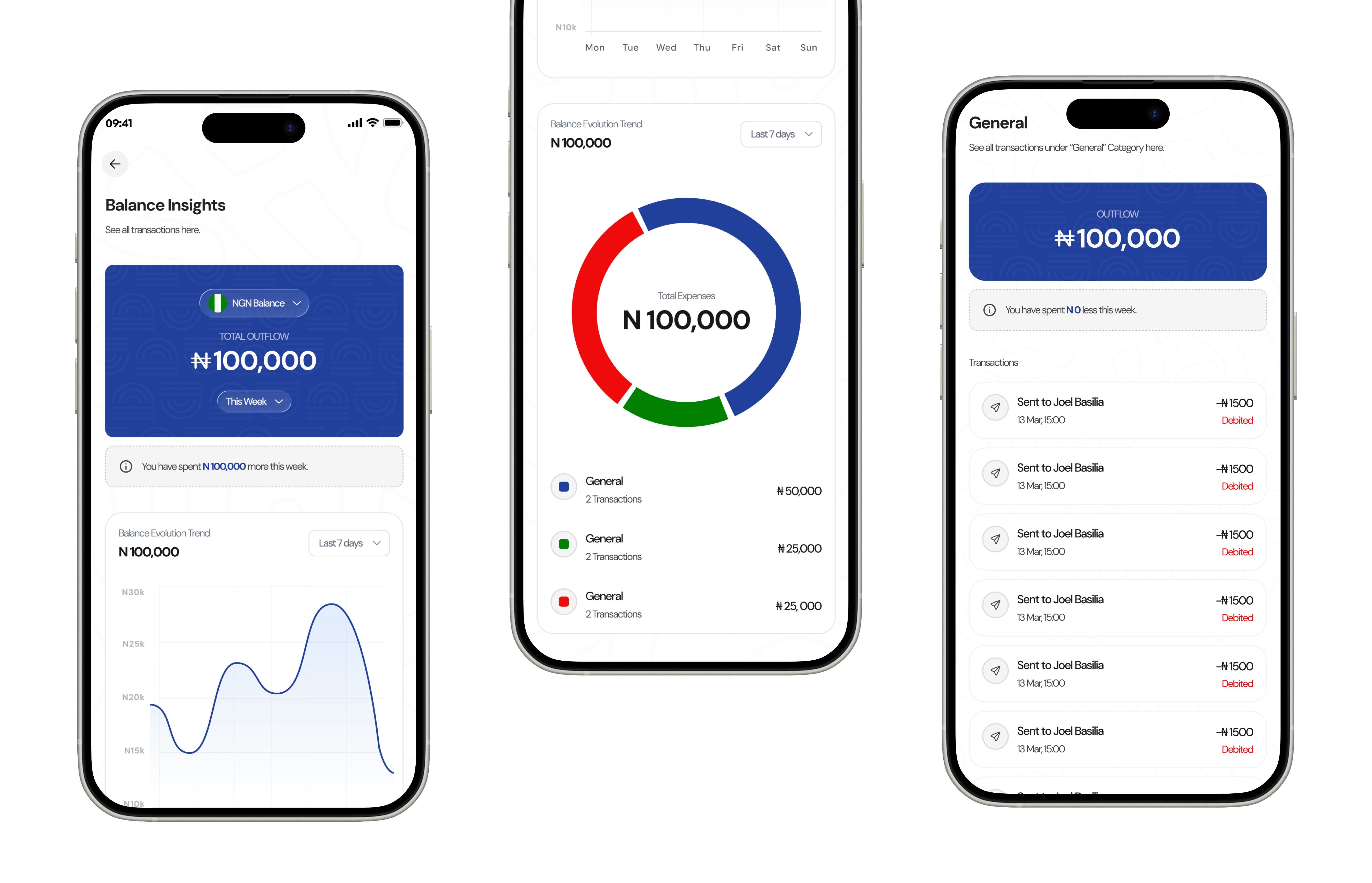
Balance Insights — signature feature
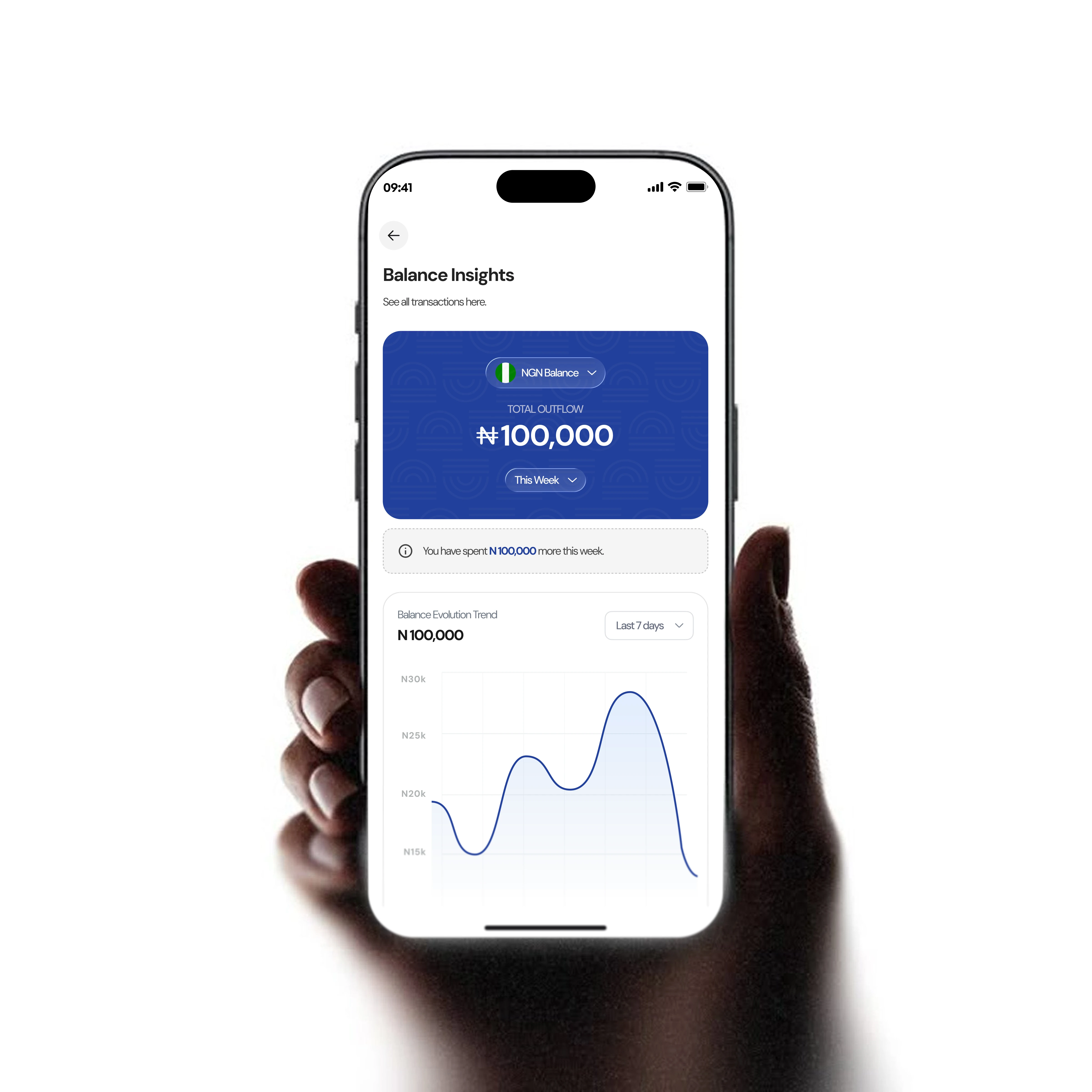
- Currency selector with weekly / monthly / all-time filters
- Total Outflow shown prominently on a blue branded card
- Contextual insight: "You have spent ₦100,000 more this week."
- Balance Evolution Trend — 7-day line chart with day labels
- Expense breakdown — colour-coded doughnut by category
- Category list with transaction count and amounts
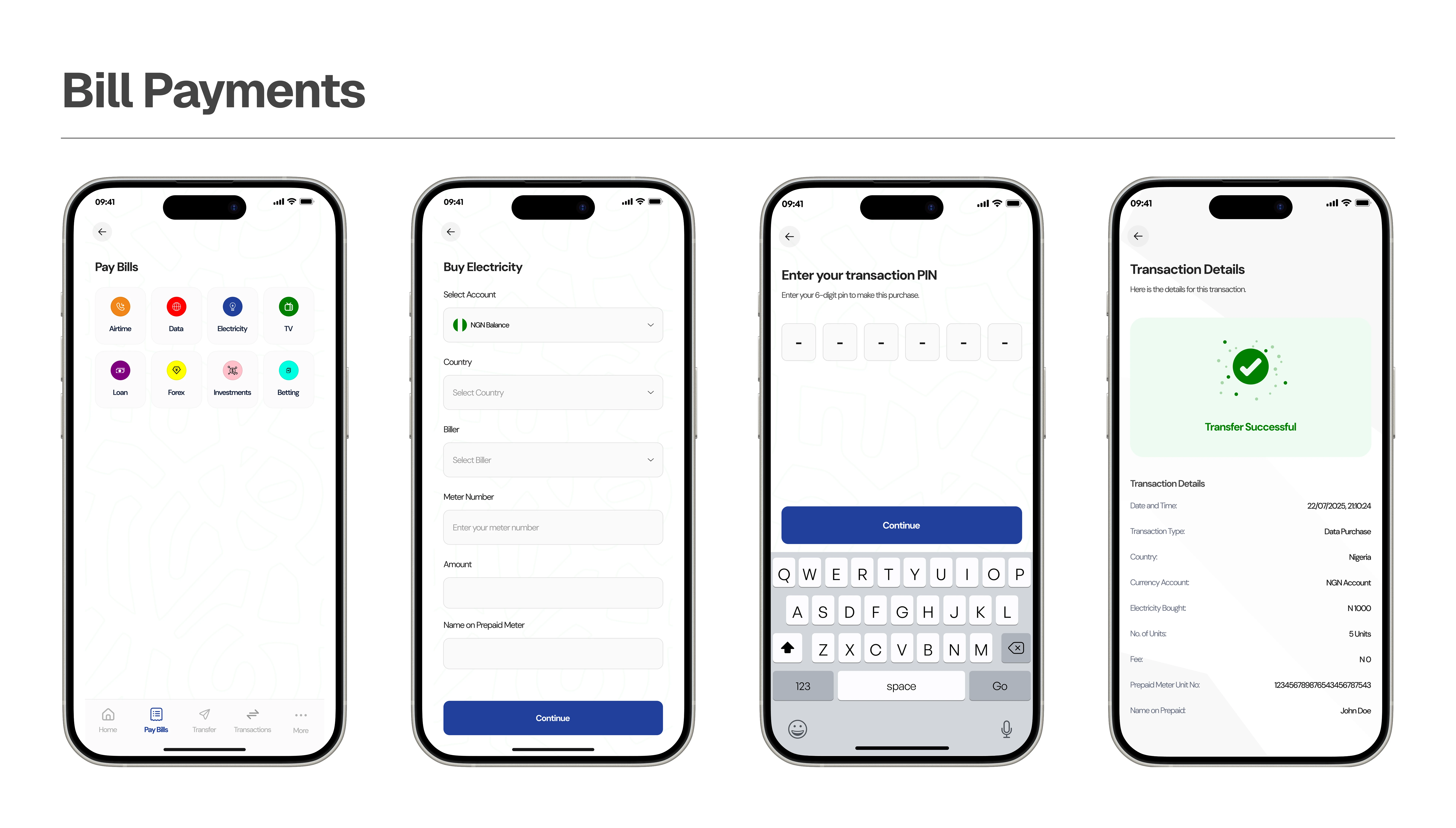
Bill Payments & My Services
- Pay Bills hub with categorised service cards
- Airtime — network, phone, amount, confirm
- Data — network, plan picker, phone
- Electricity — meter, disco, amount, token delivery
- TV — provider (DSTV, GOTV…), smart card, plan
- Betting — platform, account ID, amount
- Loan shortcut redirects to the loan module
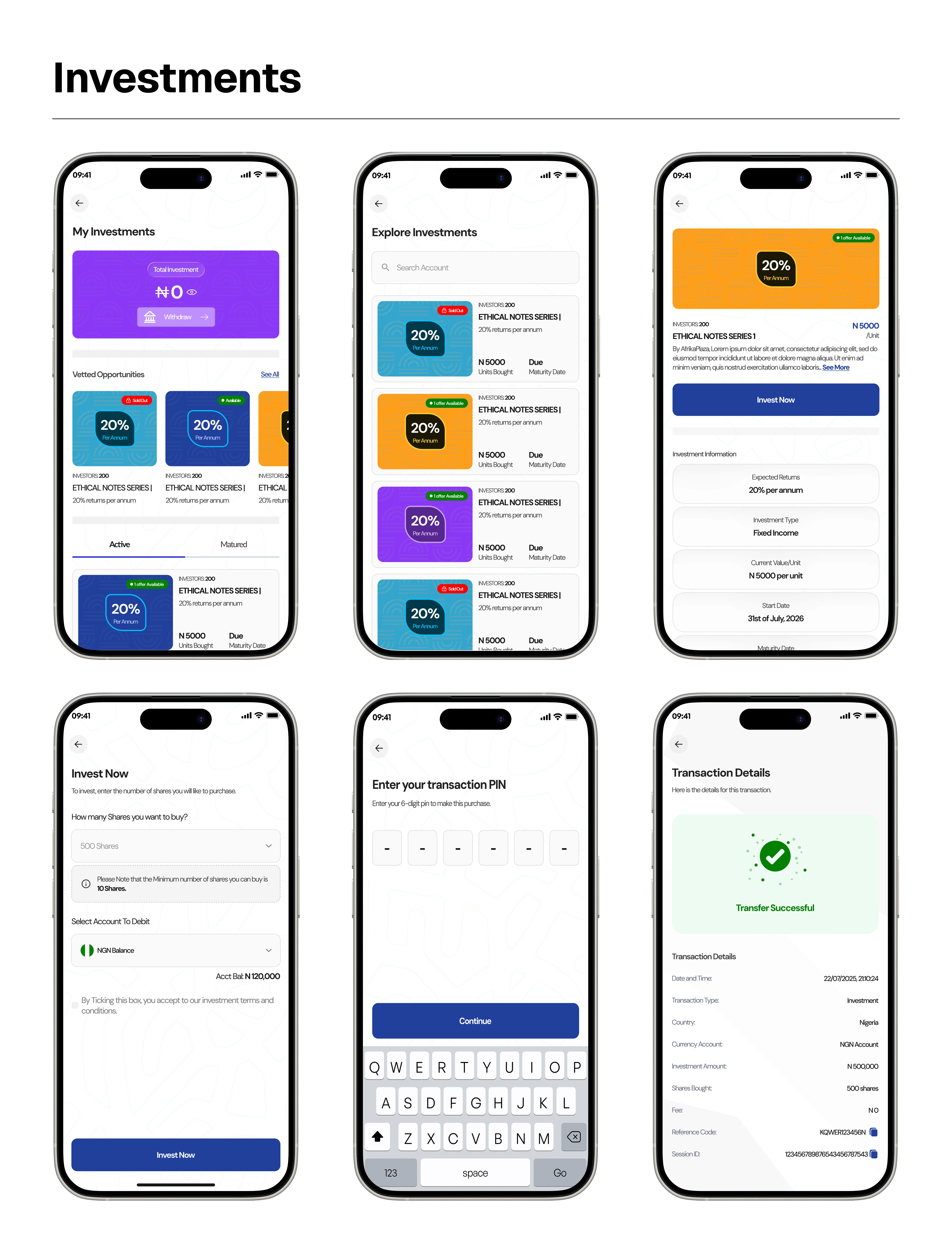
Investments
- Investment dashboard using the same branded balance card
- Quick actions: Buy, Withdraw, History, Wallet top-up
- Active list with lock icon, name, amount, tenure, returns
- Investment detail cards with currency flags
- Buy form: amount, currency, duration, terms checkbox
- Confirmation and receipt; searchable See All list
Loans — coming soon
- Dashboard toggle between "I want to borrow" and "I want to lend"
- Marketplace cards: rates, duration, lender info
- Create new loan: amount, duration, rate, currency, collateral
- Withdraw loan funds to bank or wallet
- Top up your lending pool
- Loan transaction history and statements
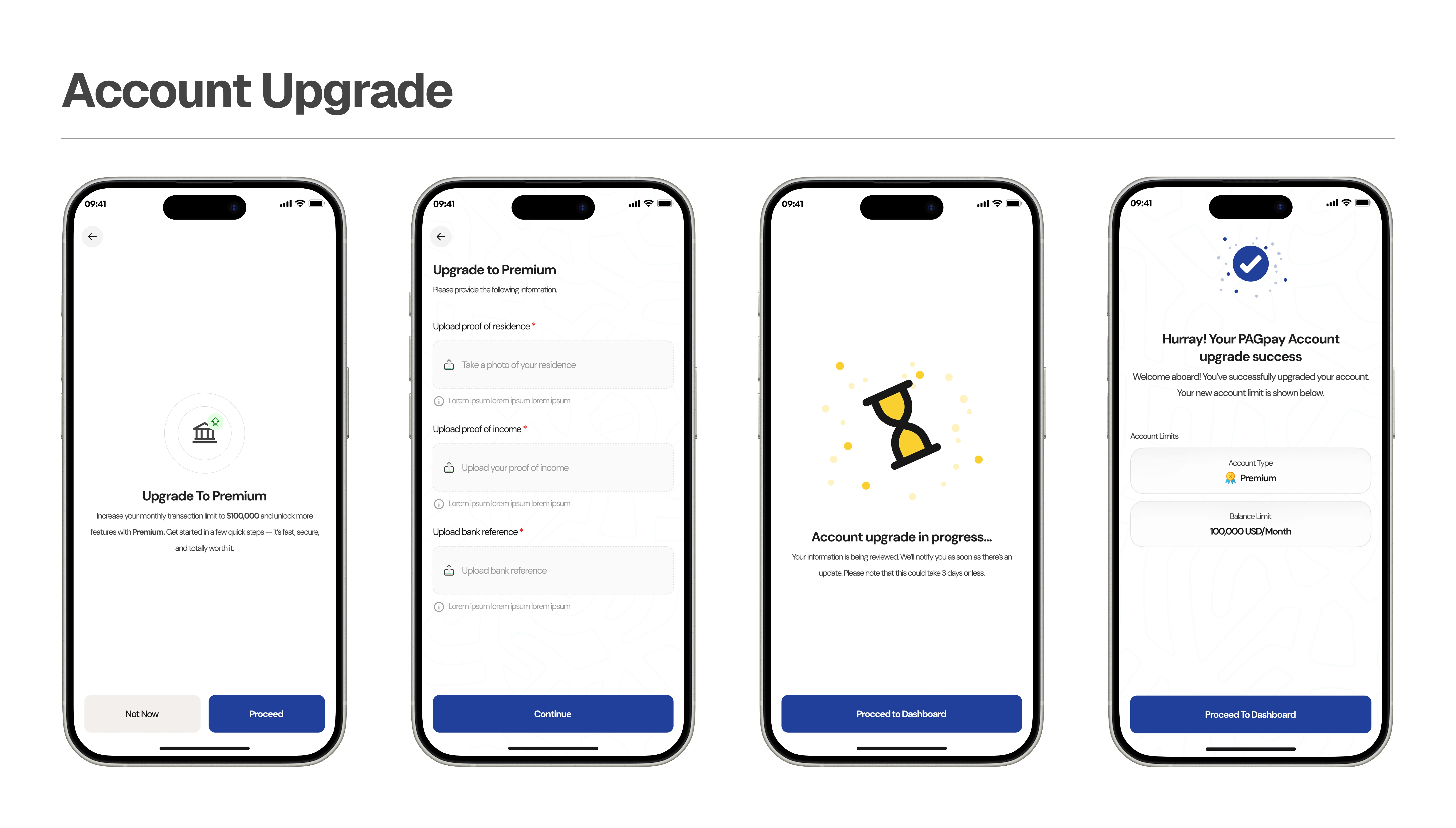
Account Upgrade (KYC Tiers)
- Tier system: Basic → Intermediate → Premium
- Intermediate — NIN verification, BVN/NIN docs, selfie
- Premium — additional docs, business verification
- Progress indicators for current tier and next milestone
- Per-tier benefits shown to incentivise upgrades
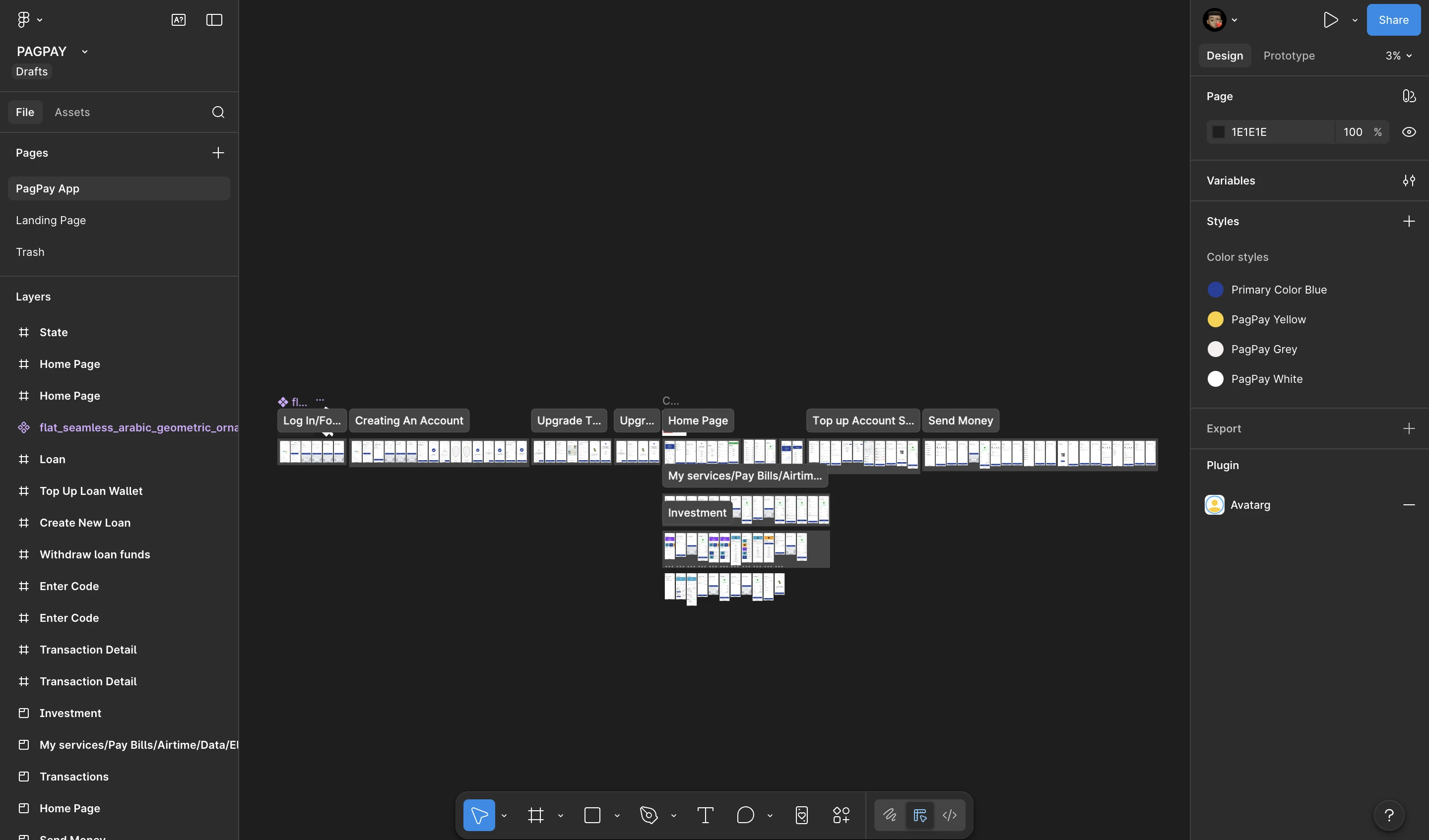
100+ screens across 11 sections
This is a complete, production-ready design for a full-featured fintech application. The Figma file spans:
| Onboarding / Auth | ~18 screens (sign up, OTP, PIN, biometrics, KYC, login, forgot PIN) |
| Home Dashboard | 3 screens (home, currency select, account details) |
| Balance Insights | 1 screen (comprehensive analytics view) |
| Top Up | ~10 screens (4 top-up methods + states) |
| Send Money | ~20 screens (5 transfer methods + confirmation + receipt) |
| Transactions | ~5 screens (list, filter, detail) |
| Bill Payments | ~15 screens (6 service types + enter amount + receipt) |
| Investments | ~12 screens (dashboard, buy, list, detail, states) |
| Loans | ~8 screens (dashboard, borrow, lend, new loan, top-up) |
| Account Upgrade | ~8 screens (tier upgrade flows) |
| Statements | ~3 screens (account details, statement, select balance) |
Challenges & how I solved them
1 · Designing for multiple currencies without overwhelming users
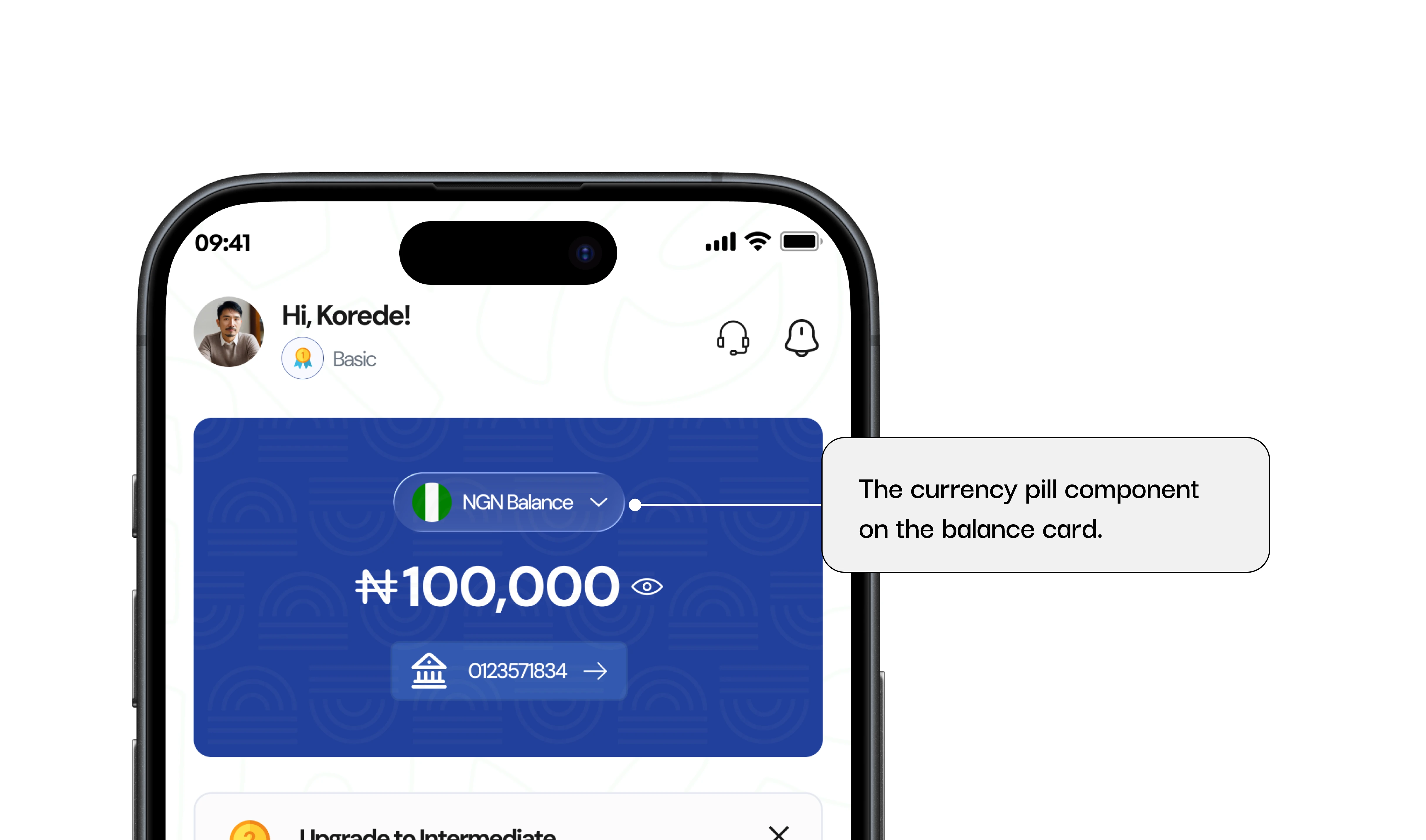
Solution: I introduced a currency pill on the balance card that shows the active currency's flag and name. A single tap reveals a currency switcher, and all transaction screens inherit the active currency context — so users only switch once per session.
2 · Keeping a feature-heavy app from feeling cluttered
Solution: Aggressive progressive disclosure. The home screen shows only the most-used actions; deeper features (investments, loans, statements) stay accessible but out of the primary flow. My Services uses a compact grid with a See All link to keep home clean.
3 · Designing trust into a financial app
Solution: Every sensitive action has a confirmation step. Account numbers pair with copy icons, receipts show full detail, and the visual language — deep navy, royal blue, clean type, no gratuitous colour — communicates professionalism. PIN creation uses a clear two-step create-then-confirm pattern.
4 · Handling the agent map flow
Solution: Rather than a plain list, agents appear on a map with details in expandable bottom-sheet cards — address, distance, and a call button each. A "See All Agents" screen offers the full list for users who prefer it.
5 · Making investments accessible
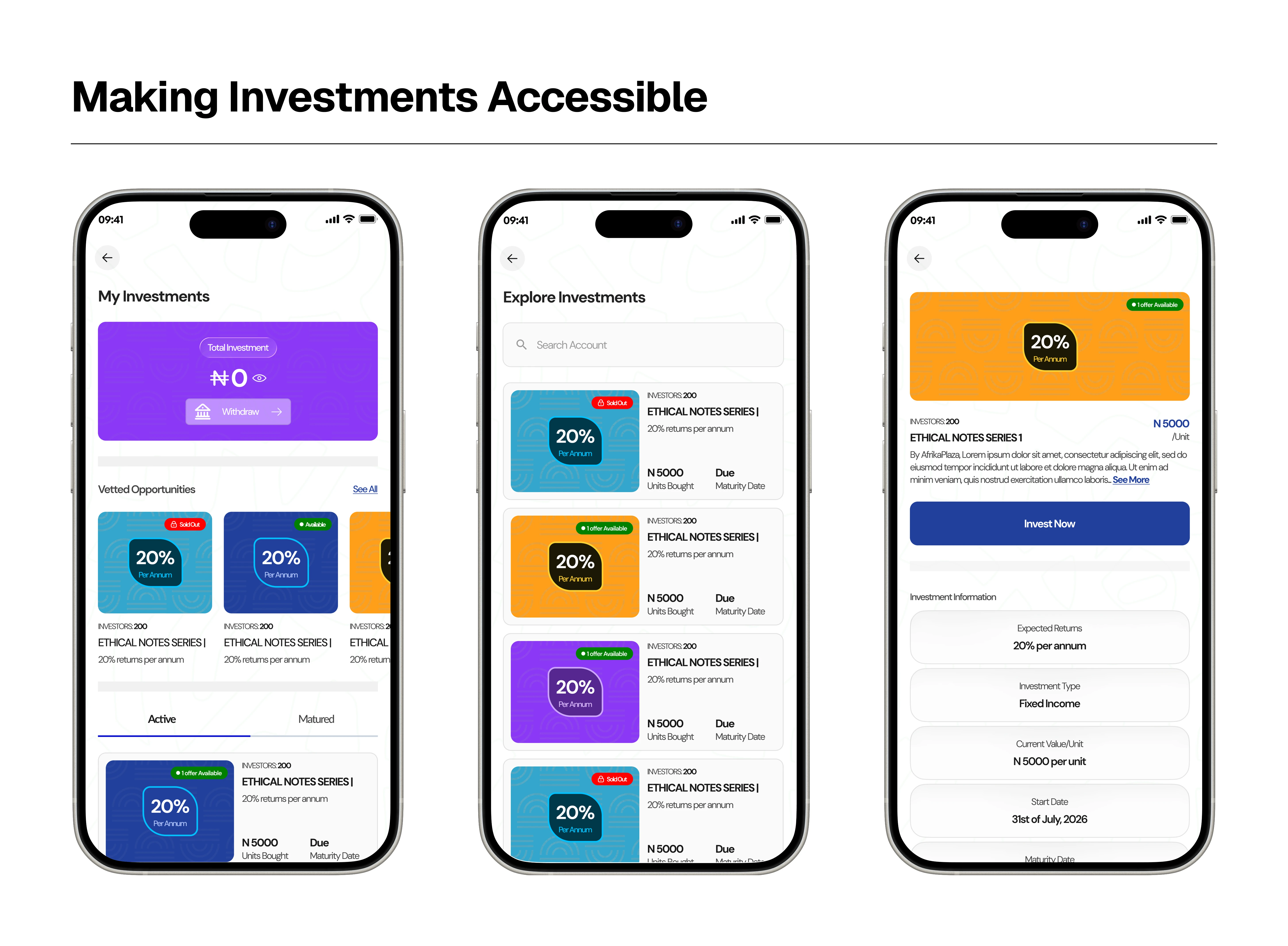
Solution: Investments reuse familiar card patterns from the balance card, so they feel native. Each shows lock period, return rate, and amount in a scannable row, and the buy flow intentionally mirrors the top-up flow — muscle memory from funding transfers straight to investing.
Key learnings
Leading design on PAGPay was an immersive exercise in systems thinking. 100+ screens across a comprehensive feature set demanded a robust component library and strict consistency across every section.
What worked well
- The balance-card component anchored Home, Balance Insights, and Investments — cohesion across very different sections
- DM Sans proved versatile — readable at 12px labels, bold at 32px balances
- Tiered KYC gives users and the business a clear growth path
- A real agent map added real-world utility most fintech apps skip
What I'd explore next
- User-testing Balance Insights — do the charts read for the target demographic?
- Redesign of the loan feature
- A dark-mode variant of the design system
- Home-screen personalisation based on transaction history
- Accessibility audit + prototype animations (currency-card flip, QR scanner)
Final note
PAGPay represents a full-scale, production-ready fintech design — built from the ground up at Parousia West Africa, with careful attention to the real financial needs of African users. It demonstrates handling complexity at scale: a unified design language across diverse feature sets, research-informed UX decisions, and a visual identity that communicates trust and modernity.